
.svg)
HealthID
HealthID is Discovery Health's digital healthcare technology for healthcare professionals that provides an overview of patient’s health records and enables the seamless delivery of patient care.
Year
3 years 7 months
Role
Intermediate UX/UI designer
Company

Discovery
Contracted from

Retro Rabbit
Project overview
HealthID (HID) has gone through various stages to where it is now. The original HID1 was created around 2012 and a few years later it was time to take on a significant upgrade which would include a rebuild in order to improve technologies and capabilities. This upgrade meant a new design creating what was called HID2.0 and was developed as a Progressive Web Application (PWA). The initial upgrade was done with online consultations as the primary focus for the initial rebuild that could run in parallel with HID1. Two years later it was clear that the information architecture for HID2.0 was crucial to be re-considered more holistically. A smarter approach to existing and new features for patient management needed to be considered with more integration and alignment in order to work together. The HID1 migration to the new platform meant considering all capabilities from HID1 collectively and not incrementally to future proof the architecture. This sparked the starting point for what is called HID3.0 and a better approach to information architecture and simplification.
Project timeline + design team

Where it started
I joined the team mid 2020 during lockdown virtually and have been ‘work from home’ since.
The project was at a stage where HID2.0 already existed with a lot of time and effort already spent.
I quickly got accustomed to the design environment and team dynamic.
I found the platform so extensive and that components were not instances of a singular master. Thus I started working on the basics of a design system to help other designers create consistent user interfaces and experiences across their assigned features. This lead to me becoming the design system creator for the team.
I developed a Strict Centralised Nebular Design System in order to create understanding of patterns and components to gain some level of consistency across the space.
The goal was to create a single source of truth to components across a broad design space.
I was also able to become the designer with a very holistic lens of our platform where decision made in one space can affect another and knowing that more in depth consideration needs to occur.
Discover
Upgrade from HID1 to HID2.0 to HID3 and lastly to HID3 in Material.
Competitive analysis and a breakdown of alternative patient management system’s information architecture, layout, content grouping and journeys to identify patterns that work and don’t work.
Team used an agile process where features were in various stages of plan, design, develop, test, deploy, review and launch.
Improve features from HID1 to gain more efficient interaction with user interface and experience.
More profile types for practice wide access.
Entire platform and each feature needed to be considered from the onset with an holistic perspective for more consistent design patterns.
Real users used instead of personas to understand in-context thinking and journey development to suit both member, healthcare professional, business and legal requirements.
Testing with different healthcare professionals each time in three categories: novice (completely new to HID), intermediate (prior experience with HID1) and advanced (early access experience with HID2.0).
What was wrong
Initial upgrade to HID2.0 did not have an holistic approach.
Feature integration was sporadic, isolated and not holistic.
Feature teams worked in silos.
Team communication across the various feature teams resulted in less than optimal decisions.
Decisions were made to fix immediate problems quickly with a less than ideal impact long term.

Challenges faced
Features would go from concept to dev very quickly in order to create and integrate relevant backend capabilities. Some frontend fixes occurred after initial build of HID2.0 but was not enough to align design and dev.
Designers input and perspective was not valued and appreciated.
Feature teams would force isolated functionality into their features which do not align to other platform interactions.
Better solutions was always compromised in order to build the product faster instead of better.
Feature teams want their features front and centre that break established categories and architecture of platform.
Frontend implementation was inconsistent and inaccurate and no time was assigned to fix the frontend implementation.
Quick solutions caught up quickly and resulted in frontend inconsistency that never got fixed.
Feature teams don’t always understand broader consideration when developing journeys.
Shift from Nebular to Material design system was required company wide and allowed a frontend rebuild.
Frontend fixes has a long delay with things partly built in Nebular and Material creating confusion.
Define
Additional features identified from HID1 with potential integration with existing patterns.
An elaborate prototype of the first iteration of HID3 used in user testing gave substantial feedback to validate direction of design.
Improved architecture and feature categorisation for easier navigation.
More transparency of features in project pipeline allowed sustained consideration of consistency and for long term growth.
A new Material design system also allowed new considerations for consistency that we didn’t have before. Additional Figma features allowed for a more compact design system.
Various workshops to clarify features was beneficial to gain input from our business departments and developers to create a transparent view of our design direction that everyone is onboard with.
Improved UX value became more prevalent with user testing feedback.
Overcoming challenges
Small amount of time is allocated to frontend fixes as features are built and additional fixes are placed in backlog to complete later. Reviews with devs during frontend build is not possible with the time constraint to get build finished.
The new concept referred to as HID3 was created as a side project to see where we could improve the platform architecture. We presented the concept and it started gaining traction with more time allocated and assigned to the development of the new layout and design. It was decide that this concept will be a great approach and implementation started a few months later. This was also where a shift happened for design feeling more valued and appreciated.
Design’s holistic consideration to solutions became much more valued and respected.
With the material transition frontend fixes in the HID3 space were done to be more accurate to design.
Quick solutions are left to designers where we can mitigate issues that could occur from these quick solutions in terms of design and user experience.
Team member changes affected domain knowledge and feature understanding is not always as clear. Tracking people with important domain knowledge to understand mechanics of data and features are not always possible.
Develop
Holistic perspective allowed faster creation and design interpretation of new features.
Continuous testing and development of the new architecture along with more in-depth understand of mental models helped establish the new approach organically.
Healthcare professional's needs were understood throughout the process and integrated as much as possible.
We considered simplicity for HID3, better categorisation and potential growth.
It was designed to be adaptable and to integrate a substantial amount of features both already integrated or still required. It considered mobile potential from the onset.
Terminology needed to be very specific as word association in relation to medical scheme, claims and legal terms are very particular.
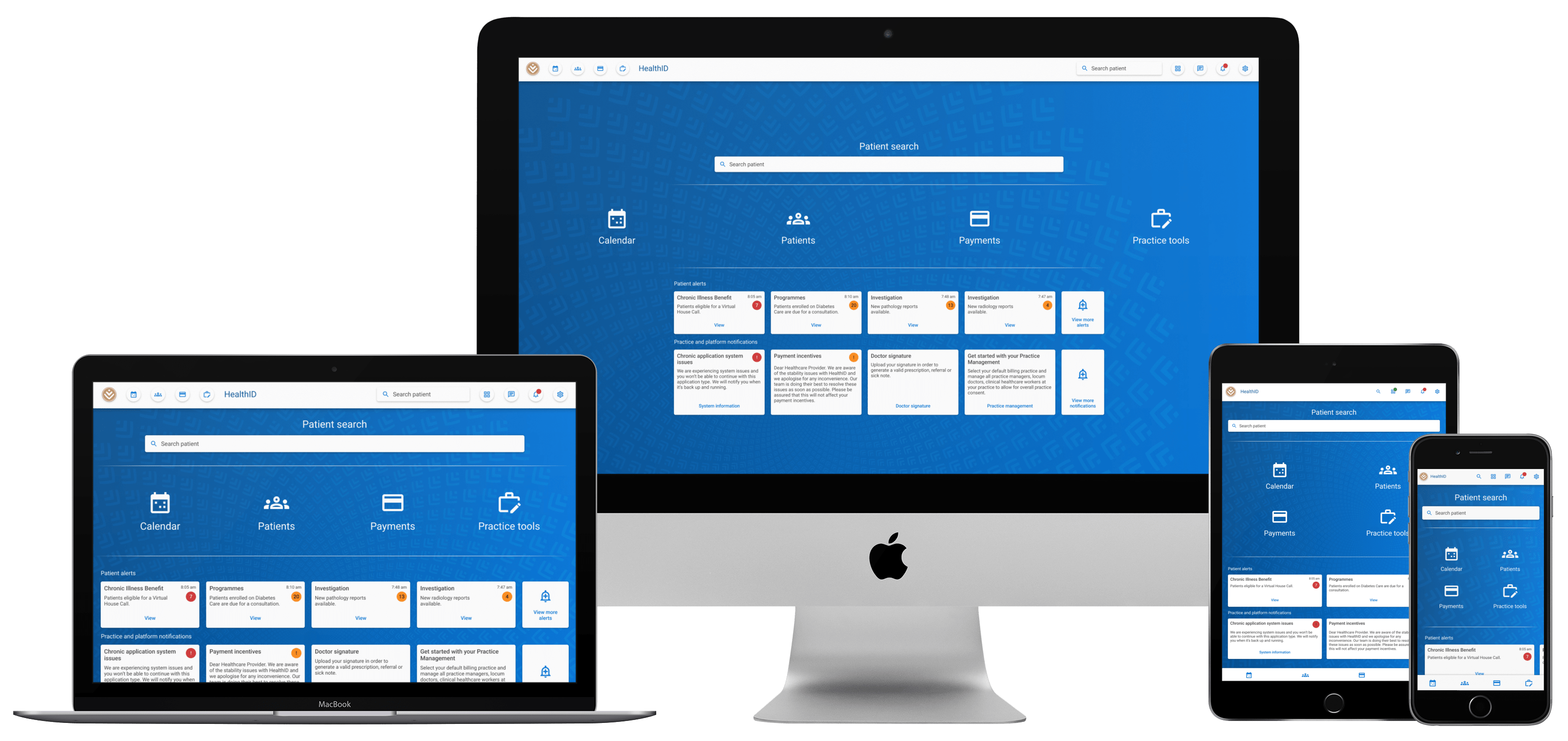
A new landing screen was developed for HID3 to showcase the restructure of content and efficient navigation.The new header navigation replicated the landing page access points in order to create association and easy navigation.
Categories aimed to create access points to journeys that fall within hospitalisation, benefits, screening & prevention, chronics and programmes. The categories then have to potential to grow exponentially.
Templates for various components created in order to establish a standardised approach to layouts that are dynamic and adaptable to relevant content.
The new Material design system was adapted and it was correctly implemented from the onset.
Responsive consideration of complex journeys to provide access with any device used.

Deliver
Providers insights and perspective was extremely valuable during the development of the platform.
Delivery and continues delivery of design solutions that are aligned to healthcare professional, business and legal requirements.
Consistent platform design that follows the same page architecture and layout patterns the healthcare professional can recognise and easily interact with again.
Designed to consider all levels of technical capabilities.
Designed with accessibility in mind.
Accessible from mobile, tablet and desktop in order to provide access to the platform regardless of context.
Elaborate prototype for testing, internal discussion and used as a development reference. The prototype has been invaluable to user testing and allowing the feature teams to understand what we are building holistically.
How it’s still going
A restructure of the team internally to Discovery meant some fresh perspectives and an opportunity for improvements.
Our new architecture and approach on HID3 gained positive feedback. This meant that more emphasis and investment will be placed on improvements.
A recently joined user testing team allows for more in-depth feedback regarding pain points and positive things we have done thus far.
The shift to Material is moving gradually forward and a meeting for frontend fixes had become a more regular thing.
Team moral is also better in gaining more positive feedback and seeing the results of our hard work.
New feature teams and their respective features are designed, developed and strictly reviewed to suit the platform architecture and their features are adapted into known behavior and experiences.

Software used
Figma
Last used: 2023
Expert

Miro
Last used: 2023
Advanced beginner